-
For my fairy tale reimagined I will be using The Three Snake Leaves. This is a story about magical snake leaves. I want the drawings to be fairly simple but still indicative of which character is who. I would love to use a simple color palette as well, and am planning on using one that I found on Adobe Color which has two shades of green, a yellow, dark grey, and a cream color. Something that always stands out to me in other people’s projects is a strong sense of design and color palette, so I want to accomplish that as much as I can while still trying a different type of design than I have used in the past.
I’m debating using words on screen, verbally spoken story, or both. I want to make sure it’s accessible, as I like having words on the screen despite being able to hear. I also want to make sure the story is mostly kept true to itself. I’m debating changing the story more to be more modern. It is also important to keep the story simple, as the original story has far more details than are needed in the time I have allotted. Because the story is pretty dark, I don’t want the characters to be dark as well. Because it’s a fairy tale reimagined and it is in theory for children, I don’t want the whole mood to be depressing and want the characters to be cute and simple.
I’m still debating backgrounds and music, but if they are added I want to make sure they don’t distract from the main characters/story.
-
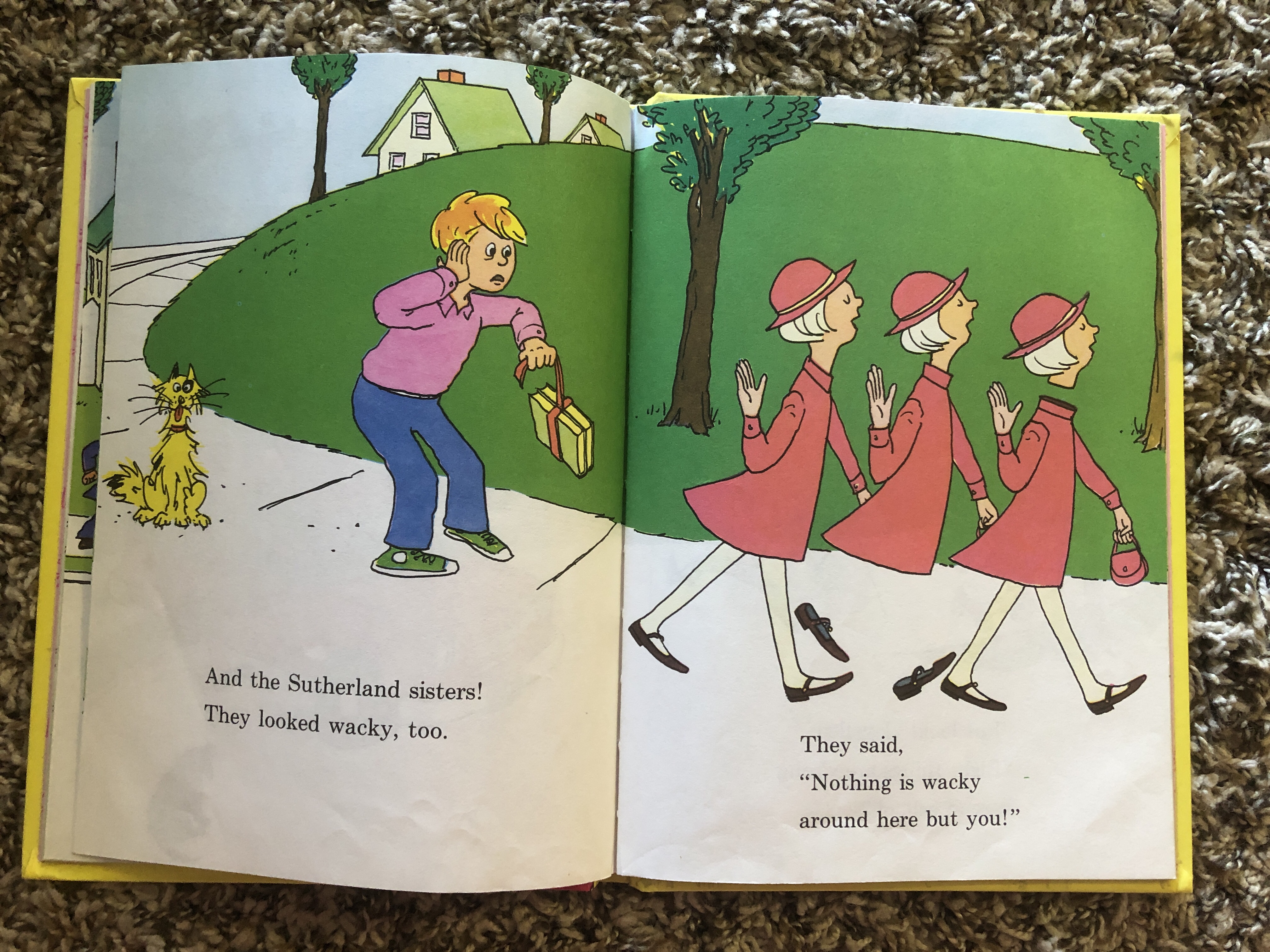
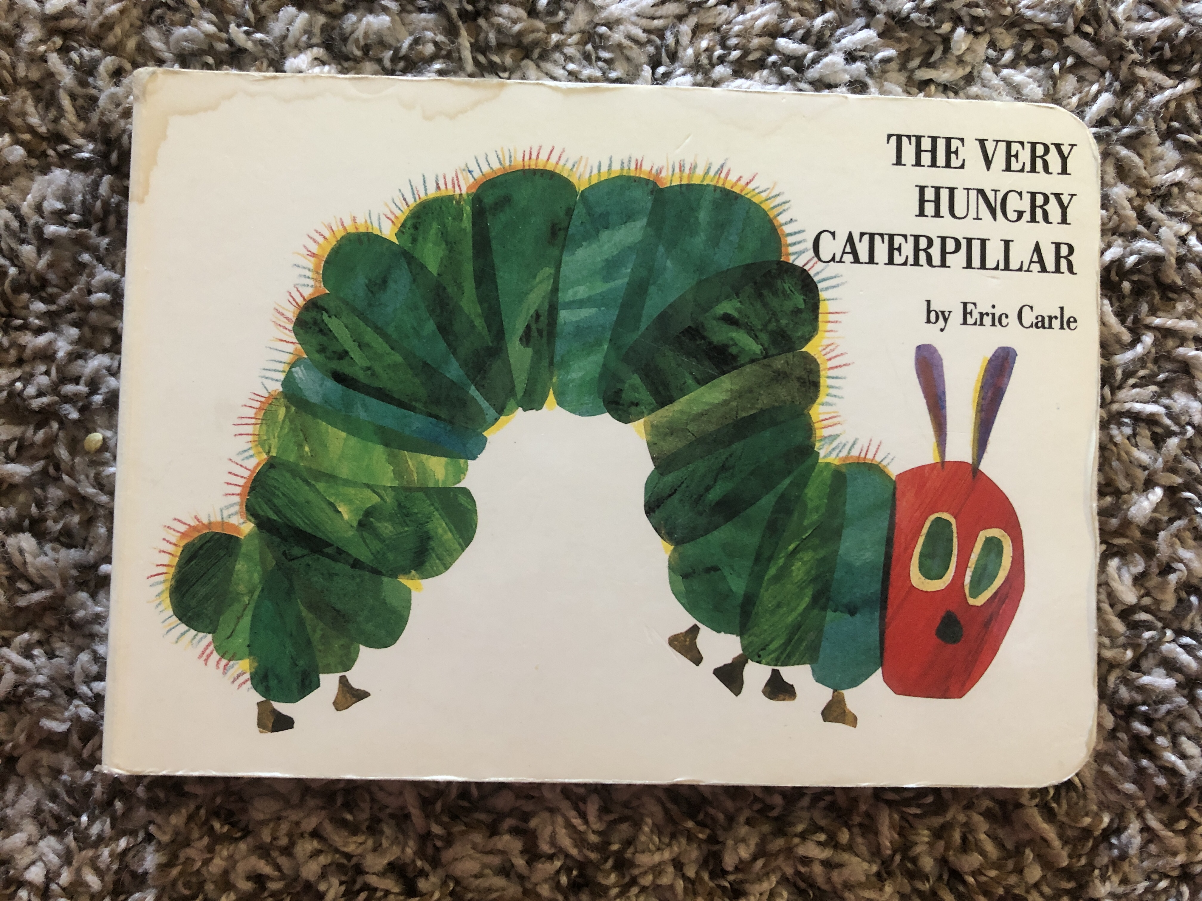
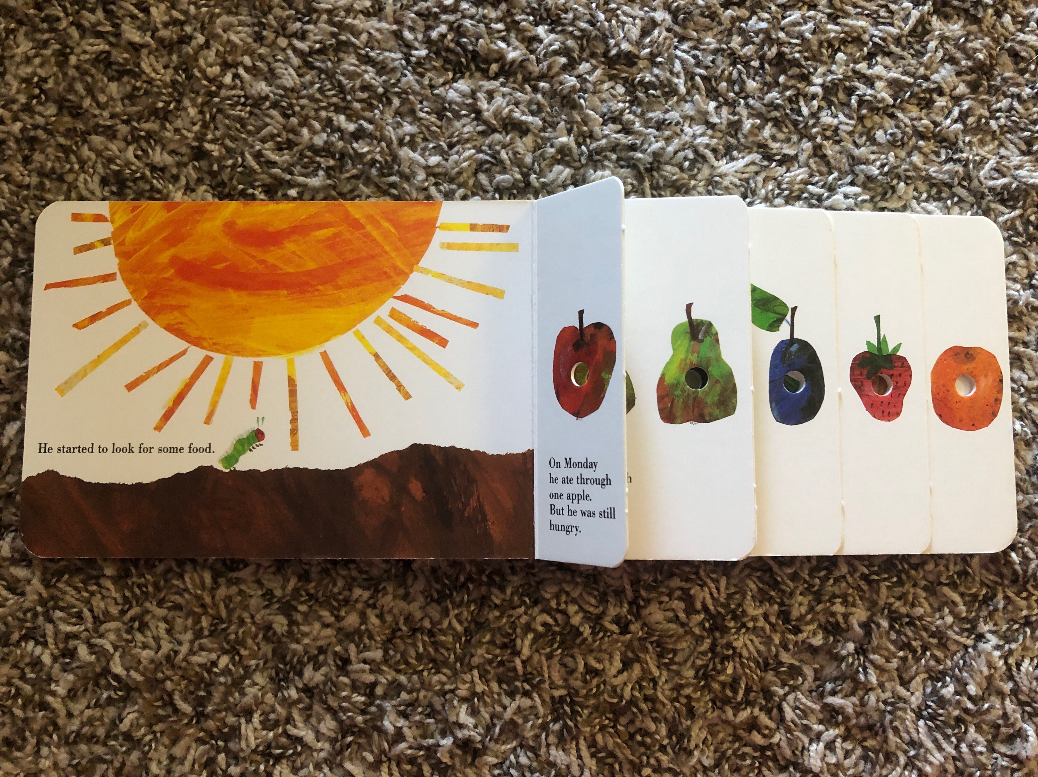
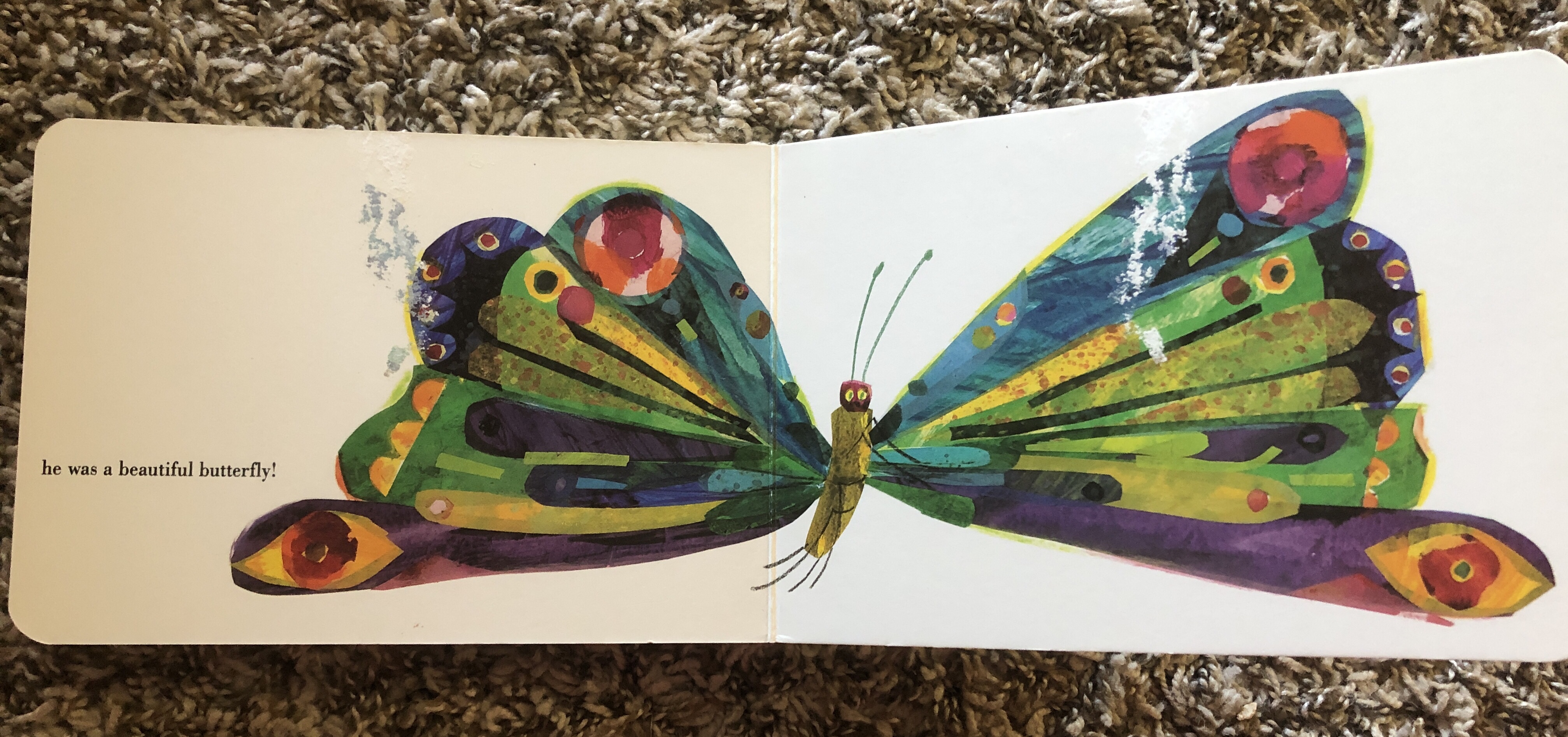
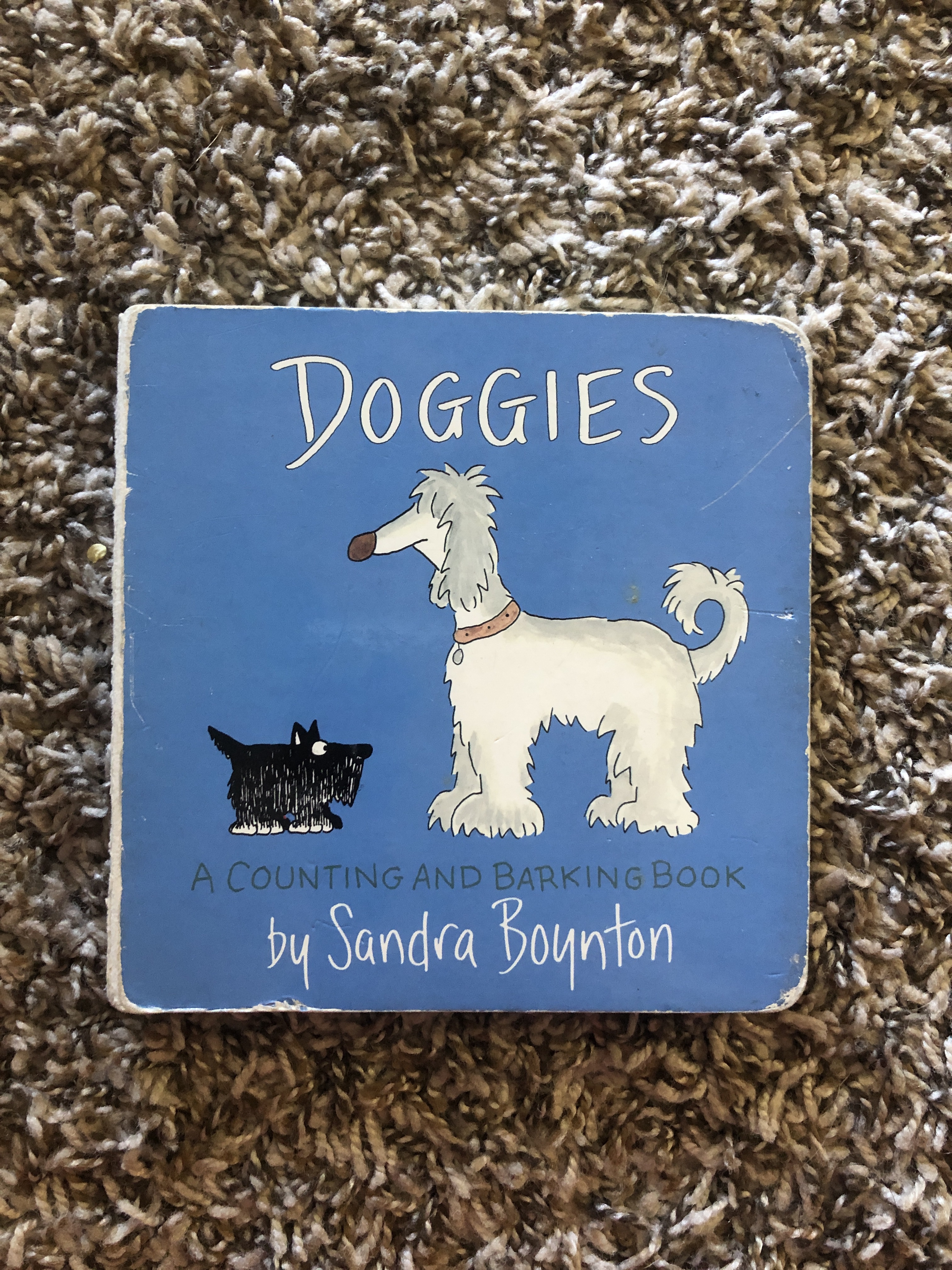
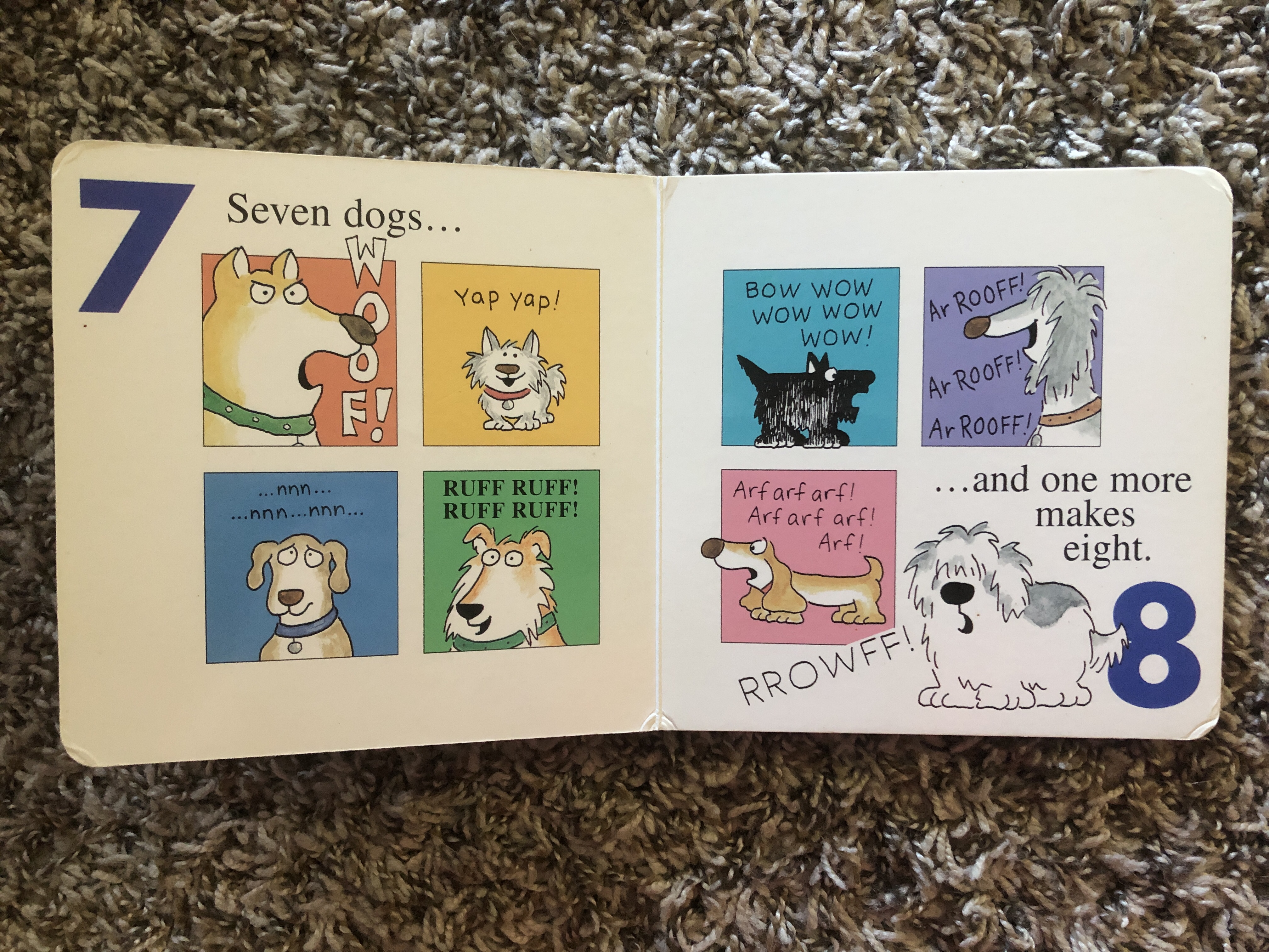
For my books I chose three of my favorites from childhood. Looking back over the assignment I realized I did largely focus on analog drawings as they are more intriguing to me. I picked Wacky Wednesday by Dr. Seuss, The Very Hungry Caterpillar by Eric Carle, and Doggies by Sandra Boyton. Each has a different style to it, but they are all memorable and iconic books from my childhood that I still remembered years after reading them last.
Each of the books has an interactive way of highlighting the content and making it more engaging than just a picture to add to the story. For Wacky Wednesday, the text is minimal, and is more about finding what is wrong with each picture. Whether the teacher was wearing rollerblades or there was a “shoe on the wall, shouldn’t be there at all!” the book has a similar feeling of searing like I Spy or Where’s Waldo where you are looking for something, but also incorporates counting each thing. The Very Hungry Caterpillar has such a fantastic look that is more artistic than Wacky Wednesday, but uses the caterpillar to tell the story. Eric Carle is a fantastic artist and I always love looking at his art in other books as well. His art style is relaxing, for some reason. Doggies is very much a read-aloud book. Each dog that is added as the book goes along has a different bark, so lots of noise is made and fun is had. The dogs look adorable and are overall pretty simple drawings but still expressive and friendly.
-
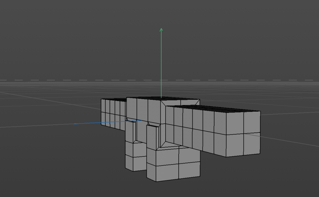
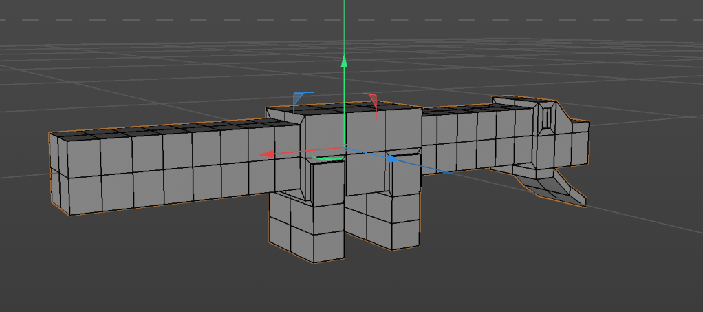
I just started this video, given it is an hour long and I’m pretty new to rigging in cinema 4d, I wanted to adhere to the recommended time for the weekly assignments.
I can post a video, but it’s still hugely a work in progress. I will use this for my Bill and Ted title sequence reimagined, so I thought it was a good way to get ahead. I’m going to have a lot to do, so it’s a good thing to work toward.
-
I wanted to work on 3D character rigging. I also wanted to try to make something funny, and look at slow motion. I enjoy the character rigging and am excited for the possibilities with this.
-
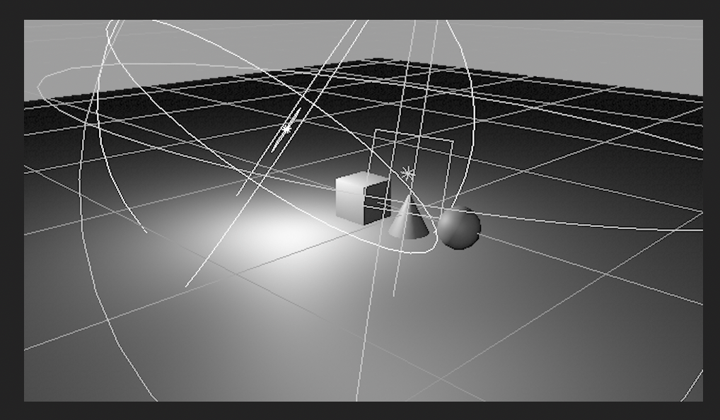
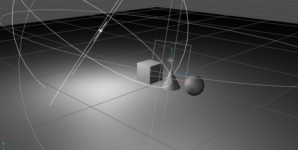
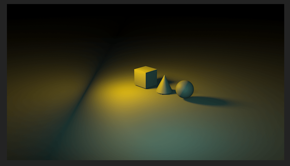
I followed this tutorial. I am still getting used to Cinema 4D, but this was fun. I figured out how to do a floor, which was exciting. In the first picture, I was just getting started, but had a light and was trying to figure out how to get it to look interesting with the spotlight, and viewed the shadows in the viewport. I then had it in AE and needed to toggle the renderer, because it was not showing how I wanted it to. I then experimented with colors and key framing to achieve my final product. I wanted to focus less on the objects, and more on the shadows, because in my next project I might be using shadows as a large component.
-
For the Title Sequence Reimagined project, I am going to use Bill & Ted’s Excellent Adventure opening credits, seen below in a YouTube video. This is honestly one of my favorite movies, so I am excited to dive into working more on this project.
I want the design to keep the cheesy late 80s energy, but as I watch this opening, it doesn’t seem to have much to do with the movie. Maybe it’s more focused on the goofy and nonsensical nature of the movie, but I find that something involving time would be interesting to include. I would love to have a sundial, similar to that below, that is the main focus of the opening sequence.

As far as visual look, I searched the internet looking for posters, and found this poster by Matt Ryan Tobin. It is a redesign of the first movie poster, based on the poster he made for the second movie. I think I will start using this color palette, focusing on the use of grey/silver, faded red, and blue/teal.

Overall, I also want to use the audio, I find it very strange and intriguing, and I want to play into that. I am really excited to work on this, and will look forward to seeing how it progresses.
-
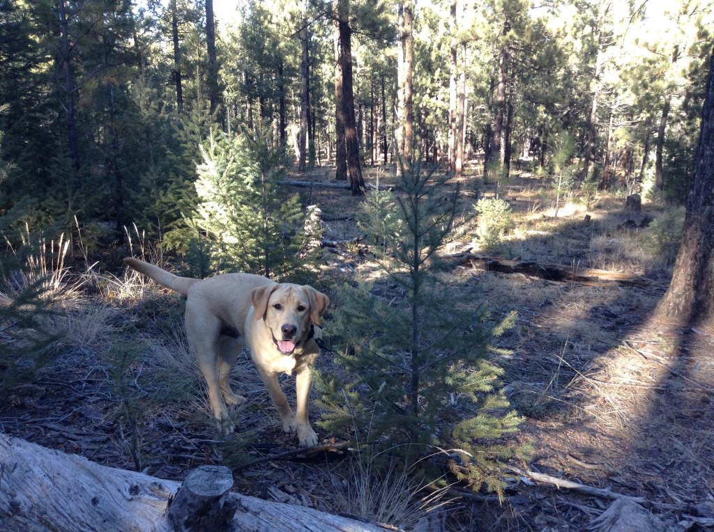
For my Low Poly Island, I wanted to use the woods where my family goes Christmas tree cutting. I think it’s in the Buffalo Creek area, but I’m not sure. Picture below for reference.
-
Subscribe
Subscribed
Already have a WordPress.com account? Log in now.


